Our logo is beautiful, and we would love to see it everywhere.
A few years ago, when we bought La Petite Mer, we wanted a logo that reflected who we are and spoke to our beautiful river, the Ardèche.
To work on our logo, we called on Atelier Hourra http://www.atelier-hourra.com
Atelier Hourra,
founded by Vanessa (and Valentin), is a branding studio based in Ardèche specialising in visual identities for players in the lifestyle, furniture design and wellbeing sectors. atelier-hourra.com+5atelier-hourra.com+5larchedenoe.com+5atelier-hourra.com+2atelier-hourra.com+2atelier-hourra.com+2.
- They favour an authentic and sustainable approach, combining authenticity, functional beauty and visual durability.
Vanessa, with her strong artistic and cultural background, acts as brand director: strategy, logo, packaging, photography… she does it all.
Customer testimonials emphasise their attentiveness, professionalism and ability to create logos that perfectly reflect the values they uphold.
The meeting
We met Vanessa and Valentin and shared who we were and what we would like to have as our representation.
Our logo had to be representative of our location, so we met for the first time at our base, by the river. Where we are, everything is green, we are under the trees, nature protects us and hides us.
They asked us for images, shapes and logos that we liked. We shared with them a few links we found on Pinterest ou and some logos they had worked on.
A few weeks after our first meeting, Valentin and Vanessa presented us with two proposals, one more focused on what we had shared and the other completely free-form.
We were immediately delighted with the free, dynamic, contemporary design. It made an instant impression on us, and we wanted to see it everywhere.
That was it, we had our logo.
Stickers, T-shirts, signs… soon our logo will be everywhere.
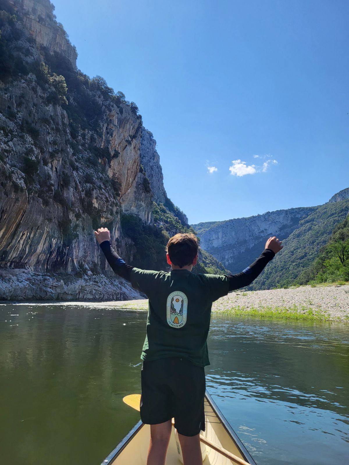
This year we also collaborated with Marion from https://www.ardecho07.com/, who designs 100% organic cotton and fair trade clothing with subtle and poetic textures. Marion advised us on the choice of T-shirt colours and sizes. Our logo is printed on beautiful organic T-shirts using eco-friendly and responsible inks.
Our team, our children, the guides and our customers are delighted to wear this beautiful logo.
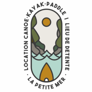
Shapes
- There is a stylised wave, reminiscent of the waters of the Ardèche and the legendary Pont d’Arc.
- The skateboard shape, very contemporary and youthful, adds dynamism to the crest.
A piece of kayak in the foreground, symbolising board sports and movement. - The arch in the centre, representing both a landmark and the famous natural bridge.
Why this logo works
- Key feature: the prominence of the arch as a central element visually anchors the base in its location, while evoking guidance (customer briefing, supervision).
- Evocative simplicity: the three symbols are sufficient to convey the activity, the location and the spirit.
- Modern typography: reinforces the professional, accessible and dynamic aspect of the base.
Our logo embodies the spirit of the base: simplicity, nature, education, adventure, all with a professional and unifying image.
Thank you to Atelier Hourra for this beautiful highlight.

